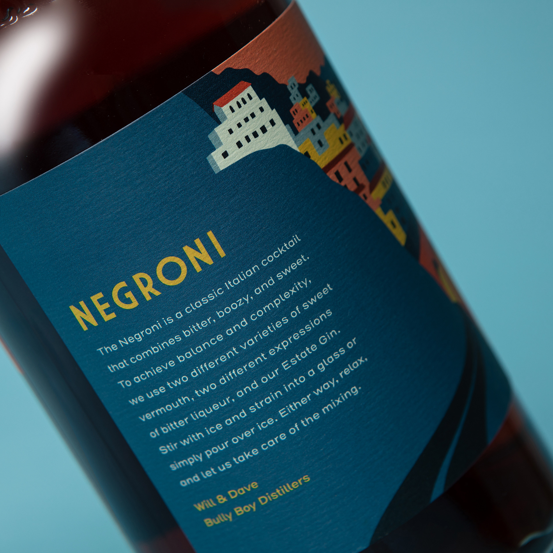
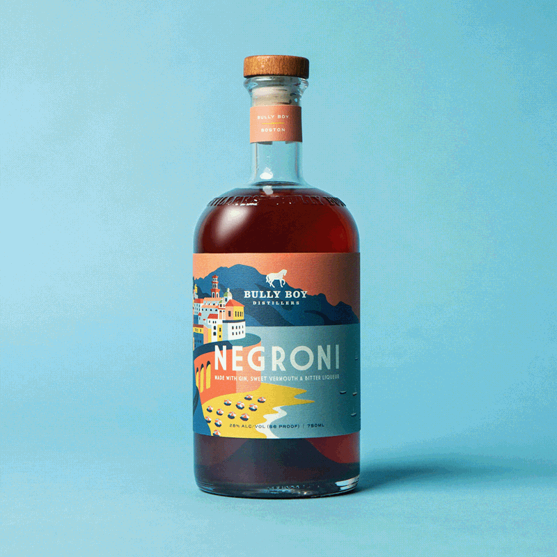
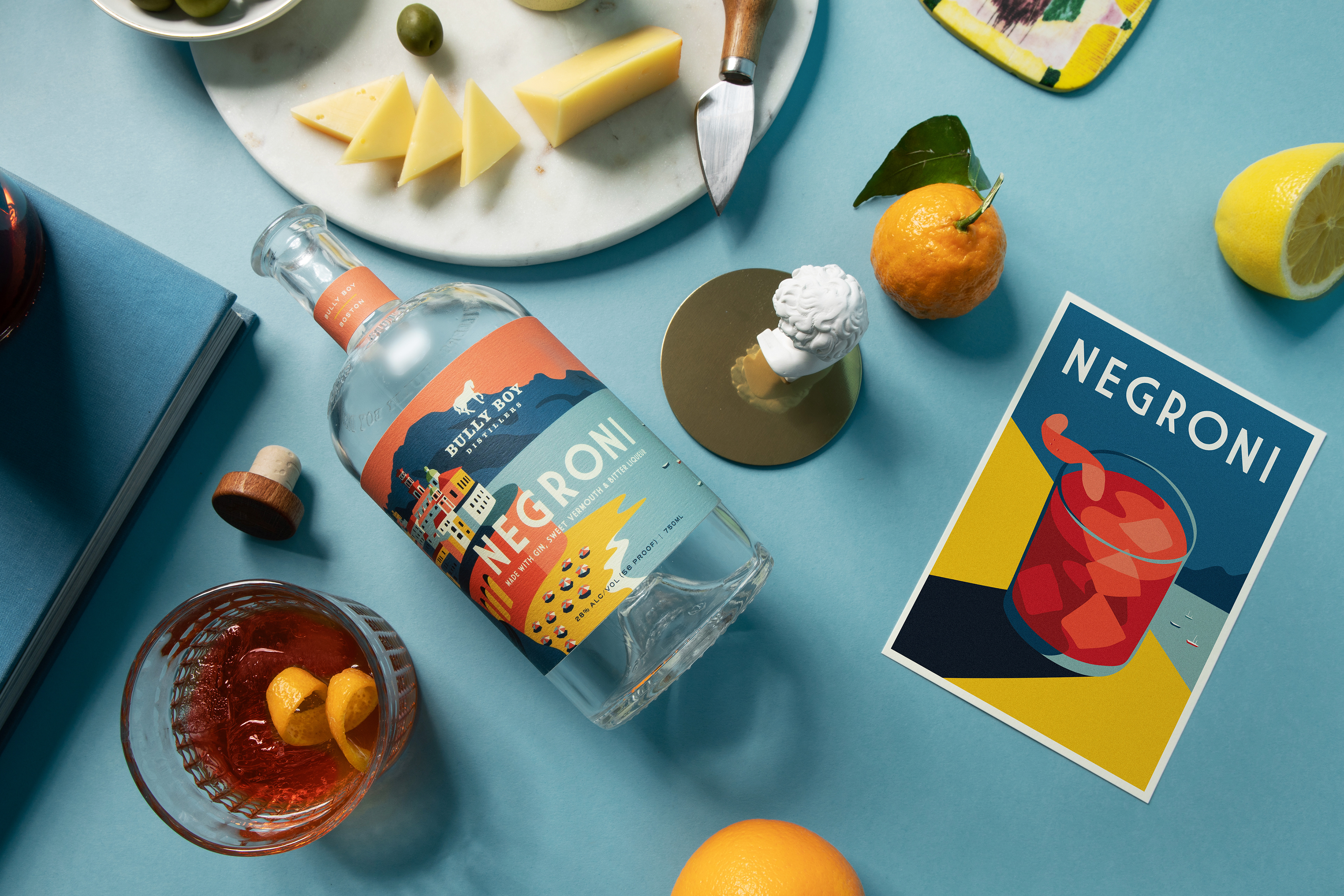
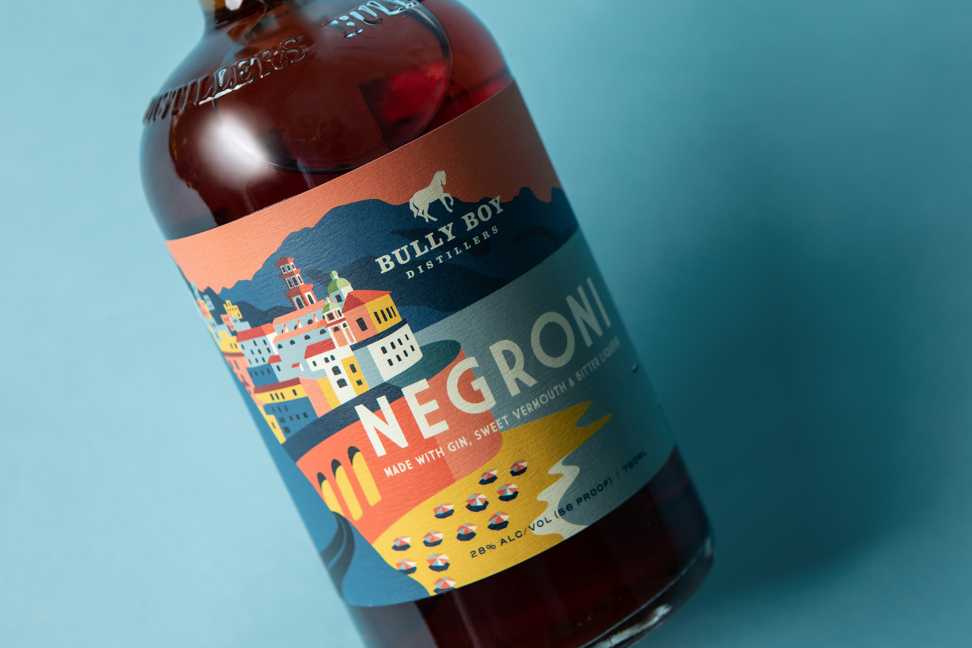
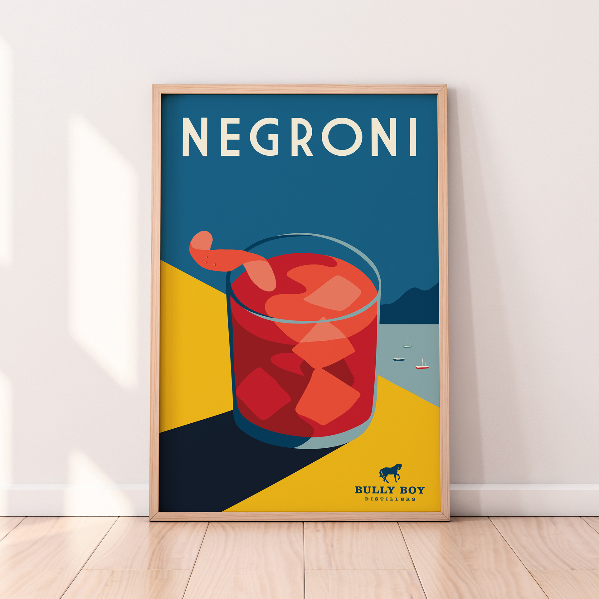


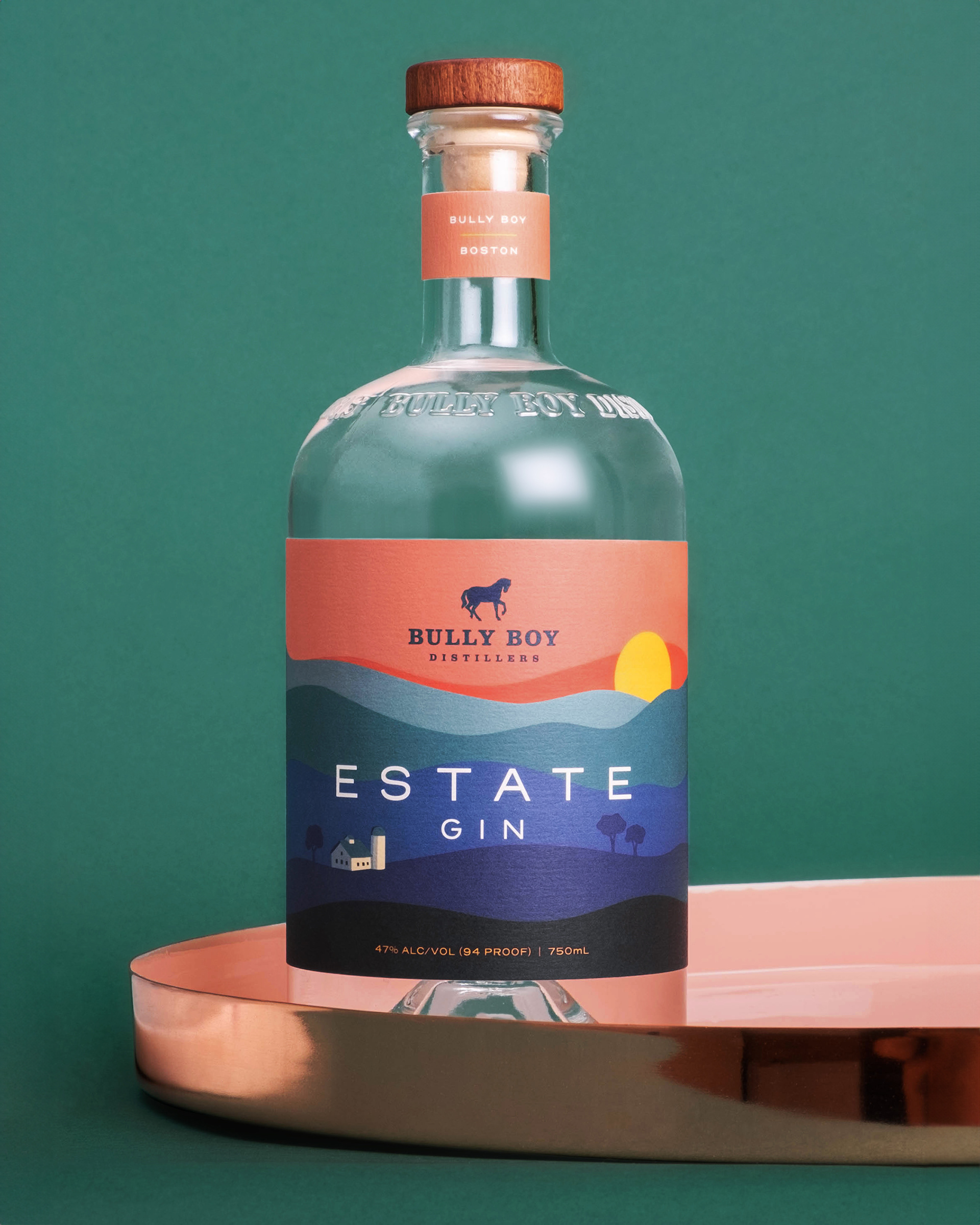


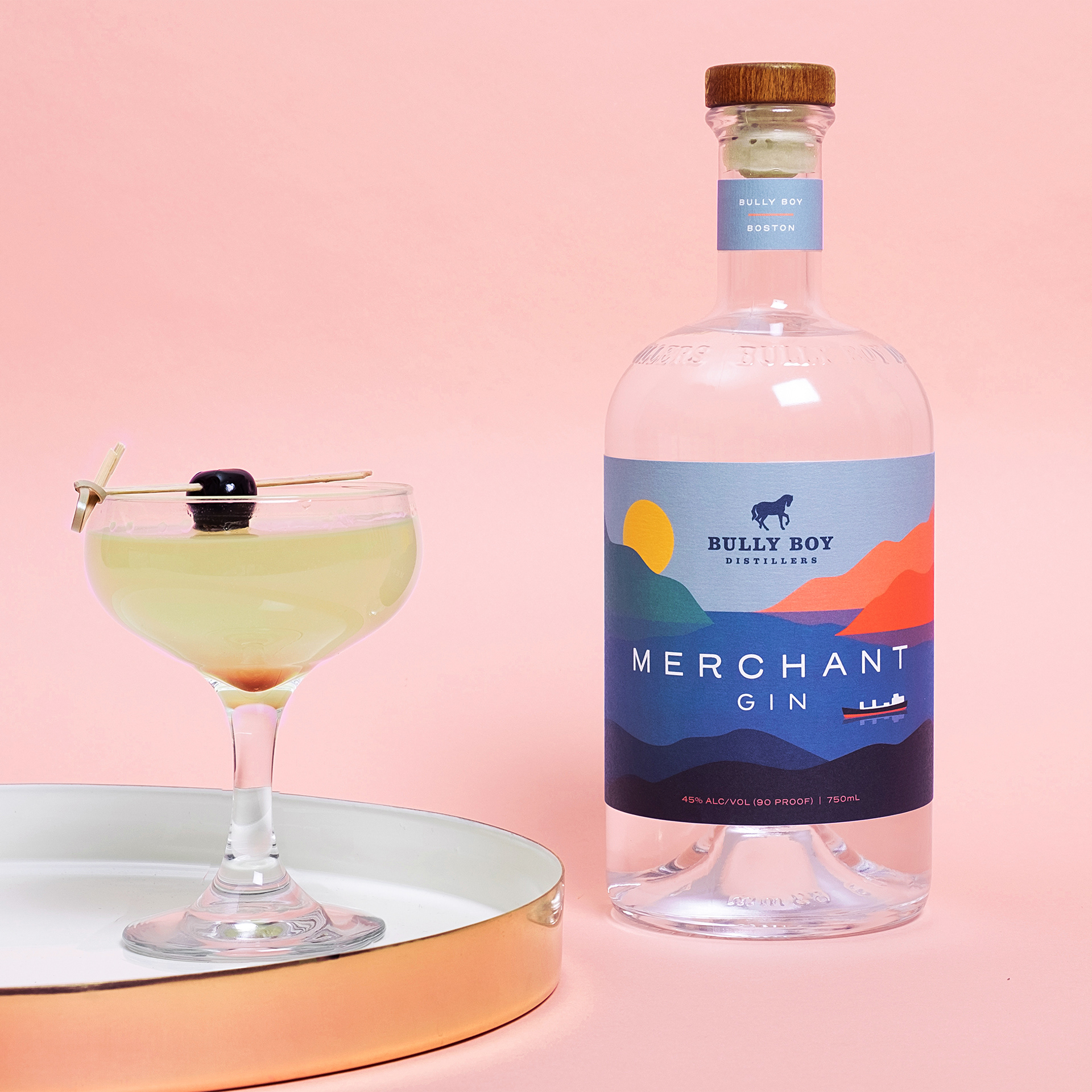

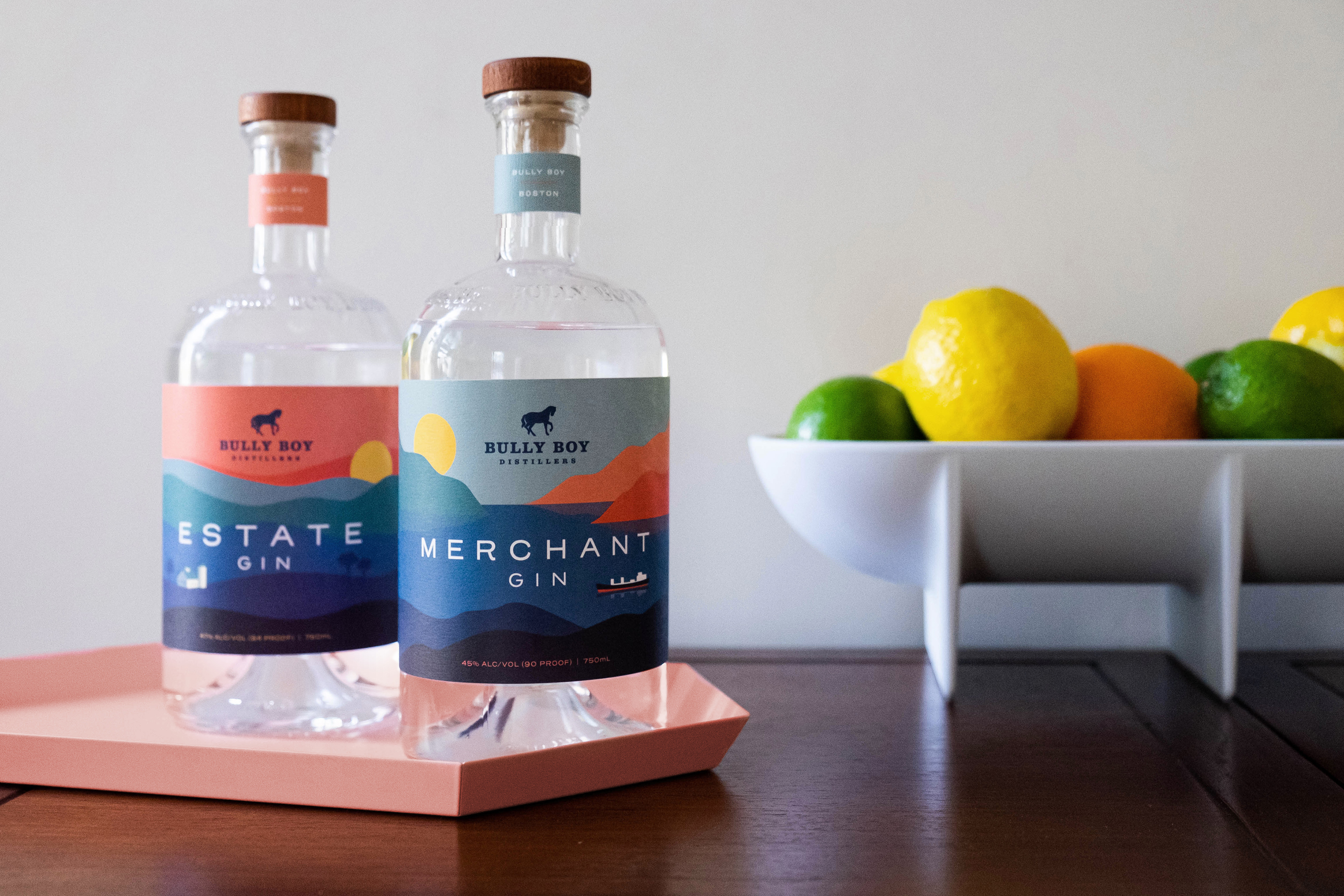
Bully Boy, a local Boston distillery, has been evolving their packaging design beyond a traditional aesthetic to include labels that feel bright, colorful and modern. The Negroni was the first bottled cocktail to join the lineup of refreshed designs. The illustration is an ode to the cocktail’s country of origin, transporting you to a vibrant seaside along the Amalfi Coast: exactly where you’d imagine sipping one. Which (fun fact) I was lucky enough to do in this very spot. The gin labels also use landscape illustrations to speak to the origin of flavor – something unique to the gin category, which often leans into a botanical motif. With homegrown ingredients reflective of the New England terroir, Estate Gin features the Bully Boy family farm where many of these flavors are rooted. Merchant Gin – the more adventurous of the two – uses offshore botanicals such as Egyptian chamomile and Guatemalan cardamom and features a maritime landscape reminiscent of the trade routes upon which said ingredients would have been transported. // Agency: Fair Folk / Role: Designer, Illustrator, Art Director / ECDs: Kevin Cimo + Jon Casey
Bully Boy, a local Boston distillery, has been evolving their packaging design beyond a traditional aesthetic to include labels that feel bright, colorful and modern. The Negroni was the first bottled cocktail to join the lineup of refreshed designs. The illustration is an ode to the cocktail’s country of origin, transporting you to a vibrant seaside along the Amalfi Coast: exactly where you’d imagine sipping one. Which (fun fact) I was lucky enough to do in this very spot. The gin labels also use landscape illustrations to speak to the origin of flavor – something unique to the gin category, which often leans into a botanical motif. With homegrown ingredients reflective of the New England terroir, Estate Gin features the Bully Boy family farm where many of these flavors are rooted. Merchant Gin – the more adventurous of the two – uses offshore botanicals such as Egyptian chamomile and Guatemalan cardamom and features a maritime landscape reminiscent of the trade routes upon which said ingredients would have been transported. // Agency: Fair Folk / Role: Designer, Illustrator, Art Director / ECDs: Kevin Cimo + Jon Casey